Boba
A mobile ordering app
This app is designed to create a visually appealing and convenient way to order bubble tea as current apps in the market seem like an afterthought.
Roles
Deliverables
I assumed the following roles for this project:
Interaction Design:
High-fidelity interactive prototypes for key tasks on mobile
UX/UI Design:
-
Competitive analysis
-
Personas
-
User journeys and task flows
-
Low-fidelity wireframes
-
High-fidelity mockups and prototypes
-
Design system and UI kit
-
Usability tests and findings
-
User Experience (UX) Designer
-
User Interface (UI) Designer
-
Visual Designer
Project Specs
Duration 4 weeks
-
Figma
-
Illustrator
-
Photoshop
Problems
-
A market full of apps that feel like an after thought.
-
A lack of consistency from the homepage to the ordering flow
-
User flow is lacking clarity for options
-
Users want to schedule orders to save time on pickup
Proposed Solutions
-
Design an app that puts the user flow first
-
Create intuitive and visually appealing UI for drink customization
-
Allow users to schedule pickup times for their orders
Empathy Matters
Creating personas put me in the shoes of the user and gain a broad understanding of their motivations and frustrations.
As research and design moved further, I focused on two personas that best represented two key problems: an intuitive and user friendly way to schedule orders, and drink customization options.
User journey maps helped to understand the user flow from start to finish. This not only helped with the user flow, but showcased possible pain points users may encounter.


Low - Fidelity, High - Fidelity


Low-fidelity mockups allowed for quick ideation and a general planning of the different screens. It also allowed me to gain an understanding for how each screen would be navigated, as well as how each screen would transition to the next.


User first
Early designs of the homepage focused solely on promotions and products over usability, while the rest of the user flow contained disjointed menus.
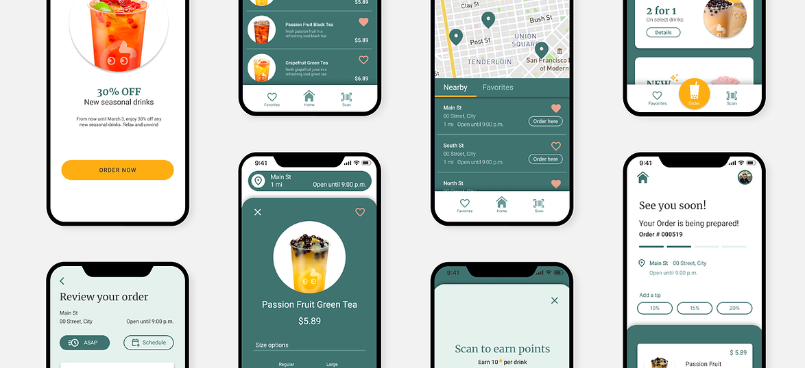
The high-fidelity prototype shows a cleaner user flow and more consistent design. It focuses on easier navigation and includes more in-depth order customization without the overwhelming feeling. Based on usability tests, different elements like the menu categories and pickup time selection were incorporated into the user flow seamlessly without taking the user to a separate screen.
(interactive prototype to the right, and also on Figma)
Visual Design
Designing Boba from the ground up was daunting and exciting. Having the freedom to fully explore from logo design to brand colours; the options were endless. Wanting to create something unique but with a strong brand identity led to the deep green that was chosen.
For the UI design, I wanted to create an open design with negative space that allowed the user to feel a sense of calm. Paired with lots of round motifs that are welcoming and mimic the shape of tapioca pearls, the overall design feels simple and easy to use.
